Ink vs. Salt to the Sea – Contest of Covers

Semi-final Round – Match 1

We’ve already discussed these covers from round 1, so in this round I’m just going to shut up, let you look at the cover, and vote.


Which will you choose? Leave your vote in a comment below. Share this post with bookish family and friends!

Note: Between education and career, I have over 15 years of experience in the field of graphic design. While I don’t pretend to know everything about design, and it will always be extremely subjective, I feel like I can speak about it with a modicum of authority (or at the very least, I don’t sound completely clueless.)

Contest of Covers – Wrapping up Round 2

What a round!

The choices were a little harder, but most of the winning covers won by a fair number of votes. Honestly, most of the match ups went exactly as I expected, except for the final. I thought Nevernight was going to end up in the final round. BUT, I may have thought that because of the weight that the title NEVERNIGHT carries. And as we know, this contest is not about the story within the book, but the cover without.

The two match ups in ROUND 3 are going to be some of the toughest choices yet. I have my thoughts on what the championship round will look like, but I can’t wait to see if it ends up coming true, or if there’s still another surprise or two in store!

Thanks to everyone who has been voting all along. This series of posts would not be possible without you.

Note: Between education and career, I have over 15 years of experience in the field of graphic design. While I don’t pretend to know everything about design, and it will always be extremely subjective, I feel like I can speak about it with a modicum of authority (or at the very least, I don’t sound completely clueless.)


Nevernight vs. Sea of Rust – Contest of Covers

Round 2 – Match 4

We’ve already discussed these covers from round 1, so in this round I’m just going to shut up, let you look at the cover, and vote.


Which will you choose? Leave your vote in a comment below. Share this post with family and friends!

Note: Between education and career, I have over 15 years of experience in the field of graphic design. While I don’t pretend to know everything about design, and it will always be extremely subjective, I feel like I can speak about it with a modicum of authority (or at the very least, I don’t sound completely clueless.)

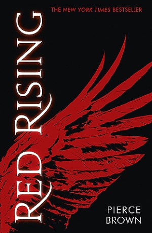
Pride vs. Red Rising – Contest of Covers

Round 2 – Match 3

We’ve already discussed these covers from round 1, so in this round I’m just going to shut up, let you look at the cover, and vote.


Which will you choose? Leave your vote in a comment below. Share this post with family and friends!

Note: Between education and career, I have over 15 years of experience in the field of graphic design. While I don’t pretend to know everything about design, and it will always be extremely subjective, I feel like I can speak about it with a modicum of authority (or at the very least, I don’t sound completely clueless.)

Hot Dog Girl vs. Salt to the Sea – Contest of Covers

Round 2 – Match 2

We’ve already discussed these covers from round 1, so in this round I’m just going to shut up, let you look at the cover, and vote.


Which will you choose? Leave your vote in a comment below. Share this post with family and friends!

Note: Between education and career, I have over 15 years of experience in the field of graphic design. While I don’t pretend to know everything about design, and it will always be extremely subjective, I feel like I can speak about it with a modicum of authority (or at the very least, I don’t sound completely clueless.)

Salt to the Sea vs. The Gilded Wolves – Contest of Covers

Previous Match Results

Match 3 was a close one, which was nice to see after two complete blowouts. Hot Dog Girl managed to knock off The Hate U Give. I would all that an upset as far as book popularity goes, but I’m glad to see that we’re all voting based on the quality of the cover design and not based on feelings on the book as a whole!

Round 1 – Match 4

Today’s match will see the highly decorative going up against rock-solid design and photography.

Ruta Sepetys’ Salt to the Sea is a chilling cover to look at. From the imagery to color scheme, the message is pretty clear: ‘abandon hope, all who enter here.’ Without knowing anything about the book itself, we know there’s a storm brewing and we’re in the middle of a large body of water with nothing but a few life preservers around us. Is rescue coming? Is something else coming? I could look at this cover all day.

The Gilded Wolves, by Roshani Chokshi, is quite the opposite. It gives me more of a feeling of hope and growth, but maybe with a bit of exclusion mixed in. Again, if we’re looking at the cover alone without knowing anything about the book, we aren’t told much. We’re on the other side of what might be the front gate to wealthy property? Gilded Wolves may be a reference to rich people who are also cruel, who might live at the very property we’ve been shut out of. It sure is pretty, though. 

I like that the title has been made part of the image. If not for the difference in color, it looks like it could be part of the metalwork, and notice the way a leaf has come forward to obscure just a portion of the letter V.

This might be another tough one, but I’ve been wrong before.

Which will you choose? Leave your vote in a comment below.

Note: Between education and career, I have over 15 years of experience in the field of graphic design. While I don’t pretend to know everything about design, and it will always be extremely subjective, I feel like I can speak about it with a modicum of authority (or at the very least, I don’t sound completely clueless.)