Contest of Covers – The Final Showdown

THE FINAL ROUND

Okay. I’ve been putting this post off for a little while, but I had good reason.

Ink had a very decisive win over Salt to the Sea, but Pride and Sea of Rust were stuck at a stalemate. I held off on moving to the final round in hopes that another vote would come alone and break the tie. That did not happen.

I could have cast my own vote, but that seemed like the wrong way to handle things. Instead, here’s what we’re going to do for the final round:

TRIPLE THREAT! 3-WAY! 1 on 1 on 1! Whatever you want to call it, we have 3 covers and only one will be the Contest of Covers Champion!


Which will you choose? Leave your vote in a comment below. Share this post with bookish family and friends!

Note: Between education and career, I have over 15 years of experience in the field of graphic design. While I don’t pretend to know everything about design, and it will always be extremely subjective, I feel like I can speak about it with a modicum of authority (or at the very least, I don’t sound completely clueless.)


Pride vs. Sea of Rust – Contest of Covers

Semi-final Round – Match 2

We’ve already discussed these covers from round 1, so in this round I’m just going to shut up, let you look at the cover, and vote.


Which will you choose? Leave your vote in a comment below. Share this post with bookish family and friends!

Note: Between education and career, I have over 15 years of experience in the field of graphic design. While I don’t pretend to know everything about design, and it will always be extremely subjective, I feel like I can speak about it with a modicum of authority (or at the very least, I don’t sound completely clueless.)

Ink vs. Salt to the Sea – Contest of Covers

Semi-final Round – Match 1

We’ve already discussed these covers from round 1, so in this round I’m just going to shut up, let you look at the cover, and vote.


Which will you choose? Leave your vote in a comment below. Share this post with bookish family and friends!

Note: Between education and career, I have over 15 years of experience in the field of graphic design. While I don’t pretend to know everything about design, and it will always be extremely subjective, I feel like I can speak about it with a modicum of authority (or at the very least, I don’t sound completely clueless.)

Contest of Covers – Wrapping up Round 2

What a round!

The choices were a little harder, but most of the winning covers won by a fair number of votes. Honestly, most of the match ups went exactly as I expected, except for the final. I thought Nevernight was going to end up in the final round. BUT, I may have thought that because of the weight that the title NEVERNIGHT carries. And as we know, this contest is not about the story within the book, but the cover without.

The two match ups in ROUND 3 are going to be some of the toughest choices yet. I have my thoughts on what the championship round will look like, but I can’t wait to see if it ends up coming true, or if there’s still another surprise or two in store!

Thanks to everyone who has been voting all along. This series of posts would not be possible without you.

Note: Between education and career, I have over 15 years of experience in the field of graphic design. While I don’t pretend to know everything about design, and it will always be extremely subjective, I feel like I can speak about it with a modicum of authority (or at the very least, I don’t sound completely clueless.)


Nevernight vs. Sea of Rust – Contest of Covers

Round 2 – Match 4

We’ve already discussed these covers from round 1, so in this round I’m just going to shut up, let you look at the cover, and vote.


Which will you choose? Leave your vote in a comment below. Share this post with family and friends!

Note: Between education and career, I have over 15 years of experience in the field of graphic design. While I don’t pretend to know everything about design, and it will always be extremely subjective, I feel like I can speak about it with a modicum of authority (or at the very least, I don’t sound completely clueless.)

Pride vs. Red Rising – Contest of Covers

Round 2 – Match 3

We’ve already discussed these covers from round 1, so in this round I’m just going to shut up, let you look at the cover, and vote.


Which will you choose? Leave your vote in a comment below. Share this post with family and friends!

Note: Between education and career, I have over 15 years of experience in the field of graphic design. While I don’t pretend to know everything about design, and it will always be extremely subjective, I feel like I can speak about it with a modicum of authority (or at the very least, I don’t sound completely clueless.)

Hot Dog Girl vs. Salt to the Sea – Contest of Covers

Round 2 – Match 2

We’ve already discussed these covers from round 1, so in this round I’m just going to shut up, let you look at the cover, and vote.


Which will you choose? Leave your vote in a comment below. Share this post with family and friends!

Note: Between education and career, I have over 15 years of experience in the field of graphic design. While I don’t pretend to know everything about design, and it will always be extremely subjective, I feel like I can speak about it with a modicum of authority (or at the very least, I don’t sound completely clueless.)

Ink vs. Jackaby – Contest of Covers

Round 2 – Match 1

We’ve already discussed these covers from round 1, so in this round I’m just going to shut up, let you look at the cover, and vote.


Which will you choose? Leave your vote in a comment below. Share this post with family and friends!

Note: Between education and career, I have over 15 years of experience in the field of graphic design. While I don’t pretend to know everything about design, and it will always be extremely subjective, I feel like I can speak about it with a modicum of authority (or at the very least, I don’t sound completely clueless.)

Sea of Rust vs. Ogre Enchanted – Contest of Covers

Previous Match Results

Another close battle! Nevernight pulls out the victory by ONE VOTE. Many people struggled with the decision on this one, some even refusing to cast a vote because they were so stricken. The second round is going to be incredible!

Round 1 – Match 8

This is it. The final match of round 1. And it involves my only personal nomination of the whole contest: Sea of Rust. It’s up against a wonderfully illustrated cover that leaves the eye dazzled and the mind asking questions, Ogre Enchanted.

This cover has everything. A beautiful forrest, magical sparkles, some kind of magic rune, and a hooded figure (either basking or freaking out) with some considerable body hair issues. The colours are very nice here as well. Even though they’re coming from different elements, there’s a nice blend from orange to magenta to blue. And in that same gamut, it almost seems like the world is changing from Fall to Spring.

The way the light plays across the whole scene is nice. But especially how it plays with the cloak, shining through in places, showing us something but not everything. It’s a nice touch.

I can’t get over the colours in this cover. Even though there’s no foil or embossing to speak of, seeing this cover second hand really don’t do it justice. Everything bleeds into the next thing. Metal bleeding into rusty metal. Rusty metal bleeding into a rust coloured sky. Sky into sand.

The graveyard of mechanical parts ramps up curiosity. Especially when one, which looks quite whole and untouched by rust, seems to be reaching into the centre of the sun. Our title is a simple font, which I’m a big fan of. Simple doesn’t mean bad. Usually, it’s quite the opposite. Think of every cover you’ve ever seen where someone tried to use something like Comic Sans or Papyrus because ‘it’s different.’ Plus, the text has been treated to look like it’s painted directly on our rusting metal. And you know how much I like the text being part of the scene!

Which will you choose? Leave your vote in a comment below. Share this post with family and friends and stay tuned for ROUND 2, beginning soon!

Note: Between education and career, I have over 15 years of experience in the field of graphic design. While I don’t pretend to know everything about design, and it will always be extremely subjective, I feel like I can speak about it with a modicum of authority (or at the very least, I don’t sound completely clueless.)

A Curse So Dark and Lonely vs. Nevernight (UK Edition) – Contest of Covers

Previous Match Results

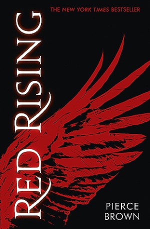
Our most recent match saw Red Rising take the win over Opposite of Always, snagging two thirds of the votes. And I know what you’re thinking. No, I didn’t vote. I wanted to, but I felt like I was too close to it to make an objective decision. Fortunately, others didn’t have that problem. However, Red Rising will have to take on Pride in the next round… yikes.

Round 1 – Match 7

A Curse So Dark and Lonely has depth. Those thorns and branches seem to go on forever. Looking at it, I find myself trying to look deeper, actually moving my head around for a better angle, hoping  to see something more. 

The text plays nicely with the foliage as well, branches threading through and between letters. Anyone who’s been following this contest knows I’m a big fan of the text and elements playing together. 

Color scheme and aesthetic are both on point as well. It’s night time. I’m lost. I’ve stumbled into something that has massive thorn bushes as far as the eye can see and I have no way of getting out. I’m stuck and feeling hopeless. Very well done.

Nevernight is a completely different animal. When it was nominated, the UK version was specified, so that’s what we’re looking at here today.

On the surface, the imagery is already effective, but then we look deeper. Other images emerge from the feathers and now we’re seeing people and things from the story. Once having read the story you could even go back and see actual events blatantly taking place (though anyone who hasn’t read wont make sense or spoiler from them.)

If the design itself doesn’t speak to you personally, there have been reports on the internet of copies of this book selling for insane amounts of money. The cover certainly isn’t the only reason for that, but I’m sure it contributes. 

Which will you choose? Leave your vote in a comment below. Share this post with family and friends and let’s see how many votes we can pull in this week!

Note: Between education and career, I have over 15 years of experience in the field of graphic design. While I don’t pretend to know everything about design, and it will always be extremely subjective, I feel like I can speak about it with a modicum of authority (or at the very least, I don’t sound completely clueless.)