Round 2 – Match 3
We’ve already discussed these covers from round 1, so in this round I’m just going to shut up, let you look at the cover, and vote.

Which will you choose? Leave your vote in a comment below. Share this post with family and friends!
Note: Between education and career, I have over 15 years of experience in the field of graphic design. While I don’t pretend to know everything about design, and it will always be extremely subjective, I feel like I can speak about it with a modicum of authority (or at the very least, I don’t sound completely clueless.)

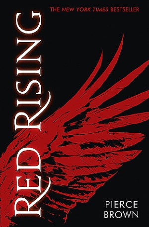
I’ve always loved Red Rising, it’s simple and effective.
Red Rising!
Sorry to disappoint but I HAVE to go Pride on this one. I love this cover so much
I’m going with Pride on this one. Maybe it’s because I haven’t read Red Rising, but the cover is so dark, and I love the modern spray paint over the old school tarnished metal plate.
I’m going with Pride on this one. I like the simplistic cover or Red Rising but there’s just something that’s drawing me to Pride.
I absolutely love the Pride cover! It’s so gorgeous.